Bad Cover Art…Redesigned: Spawn by Shaun Hutson
It saddens me to report that the valiant beckiw has been injured in the line of duty, may her mighty arm recover from the strain of photoshopping soon. But fear not! The column must (and will) go on!
I apologize for any eye injuries I may inflict upon you all with my attempts at last-minute cover art competence. You have been forewarned.
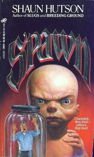
This week’s target for redesign is a horror novel from the ’90s. Behold!

I have a confession. I think this cover is perfect. Why? Because it just screams cheesy gory horror novel filled with cheap thrills, which, by all accounts I have uncovered, is exactly what this book is.
I also find that horrorbaby inexplicably cute. Just look at those eyes! They’re so big and blue and horrorbaby is obviously cranky because jar guy woke him up from a deep sleep! The deep sleep being death of course.
But I digress. The point is, this cover is a nigh-perfect representation of the book’s genre classification and I cannot hope to compete with it in that particular arena.
I can, however, compete in the arena of plot relevance.
Apparently, Spawn is a story about a mentally retarded custodian named Harold who works at a hospital after being released for accidentally killing his mother and baby brother. One of his duties is to dispose of the bodies of aborted fetuses by shoveling them into a furnace in the hospital basement. However, he feels sorry for those dead babies and buries some of the bodies under an electrical pylon. Lightning strikes the pylon. The dead babies come to life a la Dr. Frankenstein’s monster, only unlike Dr. Frankenstein’s monster, these babies are telepathic psychopaths out for blood who coerce Harold in bringing people to them so that they can drink said people’s blood all vampire-like.
Or at least, that’s what I’ve gathered from the reviews I’ve read. In any case, there are telepathic vampire murderbabies running around killing people and drinking their blood. Fun times.
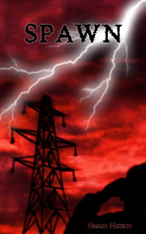
So let’s take a look at my redesign:

Dear God, I think I made it worse.
Anyways, onto my though process for this cover. At first, I envisioned the pylon being struck by lightning in the background while in the foreground, Harold staggers off with three murderbabies clinging to him. As I attempted to draw said scene however, the pylon decided to be uncooperative (evil perspective) and I realized about two hours in and after mostly completing that pylon there that I didn’t have time to draw the entire scene to my satisfaction and still get this column out on time, and so the DRAMATIC and PLOT RELEVANT scene in my head got trashed.
I then came up with the AWESOME idea to portray the exact moment the pylon was struck by lightning and SPAWNED the murderbabies because stealth puns are AWESOME. Of course, Harold needed to be included in there somewhere, so we get a silhouette of him looking at the pylon just as it’s about to get struck. He also doubled as a nice solid background upon which to stick the author’s name.
However, the cover was still quite plain as, at this point, everything was on a dull gray. Since we were talking a thunderstorm here with lightning and everything, the natural background of choice was obviously CLOUDS, and so I scribbled some suitably stormy-looking clouds in there. But that still did nothing to assuage the dullness of the grey which got me thinking: this book is supposedly incredibly bloody. Where is the blood on my cover? Nowhere, that’s where. So why not cover the cover in ALL RED. Blood everywhere. Yesss…
And that is how the abomination you see before you came to be.
Pretend everything reddish is in foil. Shiny is good. Shiny distracts. Shiny is.
—
Resources
For the font curious, the title is in Sheer Terror and the author’s name is in Californian FB. Both were acquired for free from free font sites in the distant internet past. I don’t remember which.
Everything else was drawn by hand.


